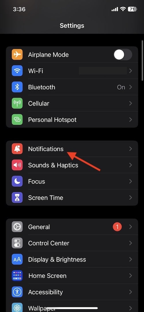

With the iOS 16 update, there’s now several different ways you can have your Notifications display on your Lock Screen. Astute iPhone users may have noticed that their Notification Center has changed drastically. While some may be a fan of how Notifications are now displayed, not everyone is going to be thrilled with the change. Fortunately, for those that like the classic view, there is a way to go back to it.
I’m going to show you how to change your Notification display on your iPhone Lock Screen, while also going through the various new ways that users are able to customize these settings. It’s pretty easy, all you need to do is navigate to a certain setting.
When it came to iOS 15, there wasn’t a whole lot in terms of customization when it came to how notifications appear on the Lock Screen. In fact, the only notification settings allowed users to tweak minor things, such as Scheduled Summary, Screen Sharing and Show Previews. However, iOS 16 has brought about new customization features, which some may or may not appreciate.
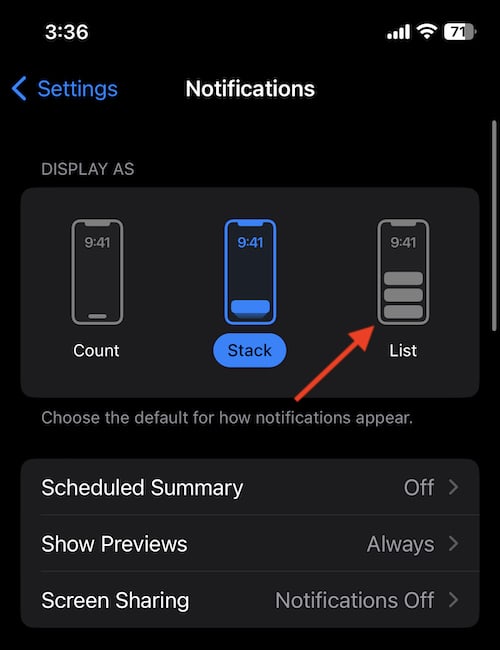
Now, users have the option for List View, Count View and Stack View. I’ll explain the differences between them, but first let’s take a look at where to change this setting.
Time needed: 1 minute
How to change your Notification Display in iOS 16


Under the Display As module, select either Count, Stack or List. If you’re looking for the classic display, you’re going to want to choose List.
You can also follow these steps again to try and see what works best for you.
For those that want the classic iPhone Notifications, you’re going to want to change to List View. If you’re not a fan of how iPhone Notifications now stack in iOS 16, you may feel a bit more comfortable with List View.
Stack View is now the default in iOS 16. This layout has your Notifications appearing on top of one another, and they will appear at the bottom of your display. By tapping on the bundle, this will expand your items, and then fill the screen. Swiping up on the bundle allows users to see older notifications that were sitting on the bottom. While not everyone’s preference, it can be a great way to show off the new iOS 16 Lock Screen.
On the other hand, Count View will hide your notifications entirely, and will only show you the total number of them on the bottom of your screen. For example, if you have a missed call, a couple of text messages and some FaceBook notifications, the total number of these will display as a count, rather than showing them to you individually. Users are also able to swipe up to view them, and then swipe down to make them disappear again.
Of course, the notifications aren’t the only thing different about iOS 16. In addition to these changes, there’s also some really cool Lock Screen customizations that users can take advantage of. However, perhaps one of the coolest new features is the ability to remove the background of multiple photos through some rather easy steps.
Whatever your preference, the new changes to iOS may have some people happy, while others may find themselves scratching their heads. If you’re not trying to show off your cool wallpaper on your iPhone, you may want to go back to the more traditional-style of notifications on your device.
While not everyone is going to be a fan of the default Notification Display in iOS 16, there is fortunately some options available to users. There’s a lot to enjoy with the operating system, so don’t let this be a reason not to update.
You must be logged in to post a comment.